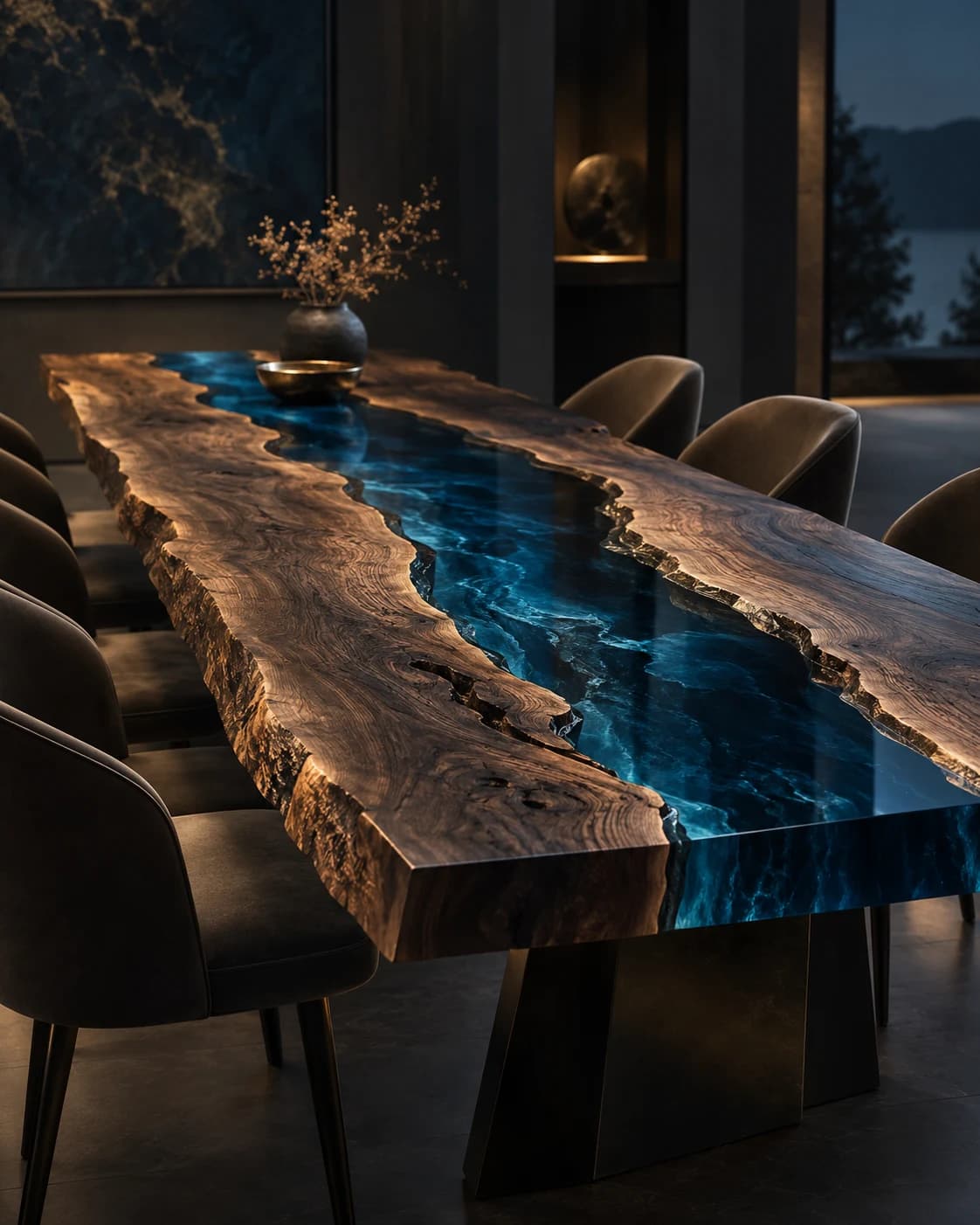
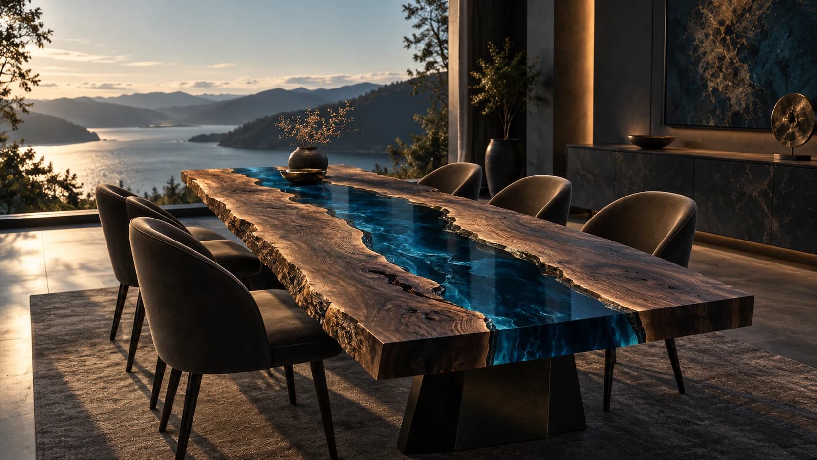
River Channel
Live-Edge Dining Table
Live-edge timber · pigmented resin · metal baseDP001 / Price on request
Follow line, contrast and the meeting of surfaces. A visual vocabulary for discussing wood and resin without mistaking a design image for a material specification.
By RivyaLivingArt · 4 minute read
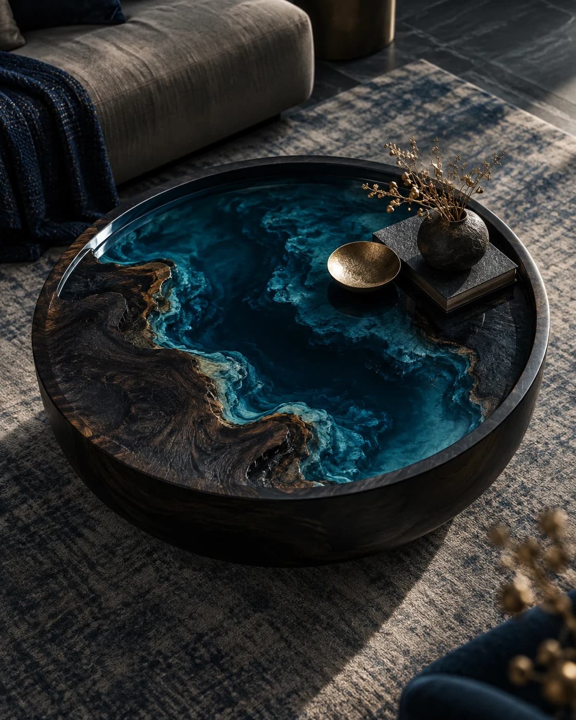
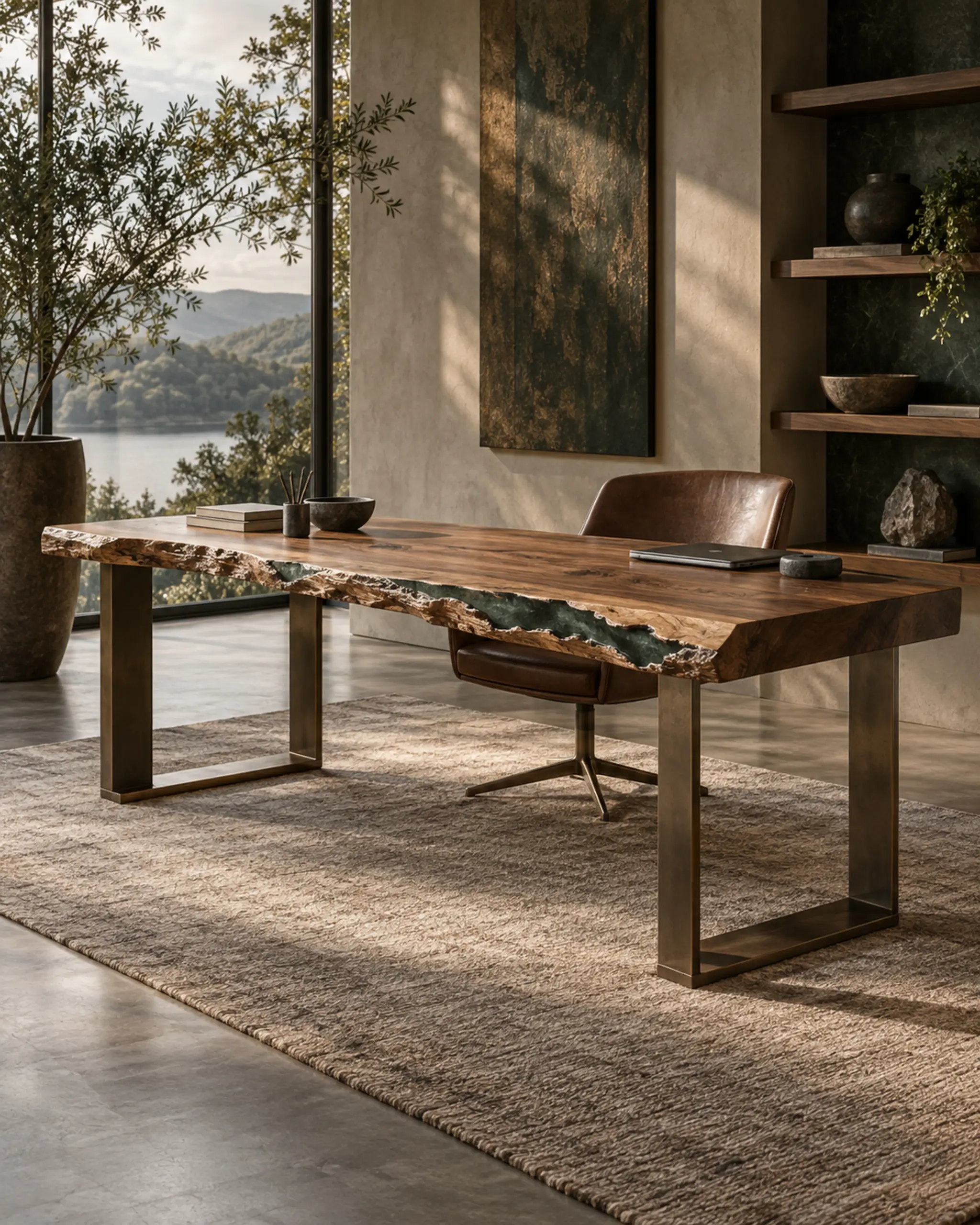
When looking at a wood-and-resin composition, begin by tracing the lines you can see. Follow the apparent grain, the edge of the timber and the shape of the area between separate elements. Does your eye move along the length, pause at a curve or return toward the middle? Describing that movement gives you a more precise starting point than saying a surface feels natural or modern.
A timber-and-resin design can serve as a visual prompt for this exercise. Use the image to discuss a visual direction, with the final specification confirmed separately. If you use a design image in a brief, identify the part that interests you. The direction of a line can be relevant even when the image’s colour, room setting or overall proportions are not.
The meeting of wood and resin can be read as an interval: narrow in one place, open in another, regular or deliberately irregular. On a reference image, imagine the timber and the adjoining area as two flat shapes. This removes some of the distraction of shine and room styling. It makes the relationship between the shapes easier to describe in a commission conversation.
A thin interval might suggest a continuous drawing across the top, while a broader area might become the main visual field. Those are compositional impressions, not manufacturing instructions. The way a real object is constructed, supported and finished needs a separate technical discussion. A reference can communicate a preference without promising that the same effect is feasible at a different size or in another material combination.
Colour is only one part of the image. Ask whether the quality you like is a warm hue, a dark field, a visible depth, or the contrast between a textured area and a visually quiet one. These qualities can be confused when they appear together in a single photograph. Give each preference its own sentence so a later material discussion can explore them independently.
Treat apparent transparency with particular care in a visual brief. Backgrounds, lighting, reflections and image processing influence what a screen shows. Say that you are drawn to the impression of depth rather than requesting an exact result from an unverified image. A physical material sample and a clear description of its viewing conditions offer a more grounded basis for decisions than a colour selected from a photograph alone.
A surface is rarely experienced only from directly above. Its edge may be the first thing visible when someone enters a room, and the base contributes another set of lines below it. Look for side views in an approved reference set. Describe whether you want the top to feel visually thin, grounded, irregular or clearly separated from its support, without assuming that an image resolves structural questions.
Choose a small number of references and annotate them. One might explain the grain direction you enjoy; another might show a restrained relationship between the top and base. Include one image that almost works and explain the difference you would want. This often reveals a preference more clearly than a large collection of attractive images without any written context or order.
Keep the source and status of each reference visible. A rendering, an approved photograph and a physical material sample provide different kinds of information. Avoid presenting another maker’s object as a design to copy. Describe the general relationship that appeals to you, then leave room for an original response to your room, dimensions and intended use. A useful board opens a conversation rather than pretending to close it.
Before a real commission, translate your visual notes into questions the studio can answer. What actual timber and resin options are under consideration? Which references belong to the proposed specification? How will the selected finish be described and approved? What care guidance applies to that particular object? These questions connect an aesthetic preference to information that needs to be confirmed for the work itself.
Give every reference a clear job, then separate the mood it suggests from the samples, drawings and recorded choices a real object will need.
Read the storyDescribe what a reference image seems to show, then ask what would need a real sample. A visual notebook on backgrounds, viewpoints, reflections and the impression of depth.
Read the storyA compelling image starts a conversation. Learn how a visualization, drawing, material reference and finished object contribute different information to the design process.
Read the story