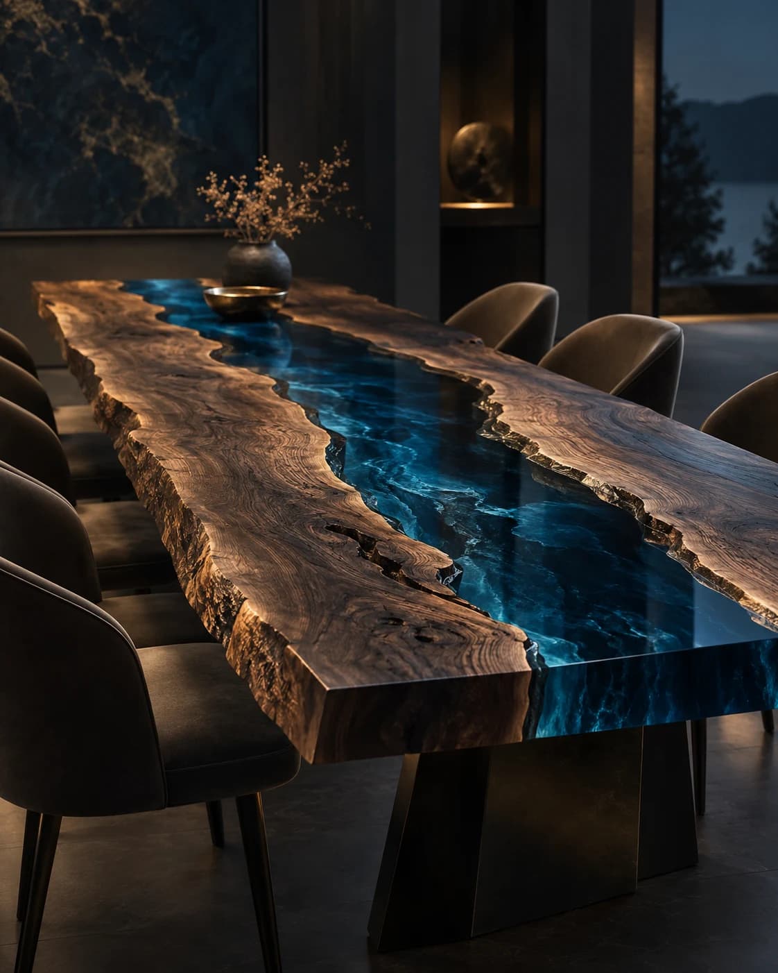
River Channel
Live-Edge Dining Table
Live-edge timber · pigmented resin · metal baseDP001 / Price on request
Give every reference a clear job, then separate the mood it suggests from the samples, drawings and recorded choices a real object will need.
By RivyaLivingArt · 4 minute read
A mood board becomes more useful when it has a purpose beyond collecting attractive images. Decide what you are trying to explain: a quiet room with one expressive surface, an object that relates to existing timber, or a contrast between a strong outline and a restrained palette. Write that intention at the top. It gives every reference a reason to be included and makes omissions easier to recognise.
Choose only a few images at first. A large collection can conceal uncertainty because each image suggests a different answer. If two references conflict, keep both only when the difference itself is useful to discuss. The board is an instrument for finding a direction, not proof that all its materials, dimensions and details can be combined into one feasible commissioned object.
Write a short note beside each reference identifying the particular quality that matters. It could be the spacing between two shapes, the apparent depth of a colour area or the balance of a top and base. Be equally clear about what you are not carrying forward. A useful image may contain a room layout, object size or decorative detail that has no relevance to your project.
Keep authorship and source information with any material shared in a real brief, and use references you are entitled to share. Discuss the underlying design relationship rather than requesting a copy of another maker’s object. Originality becomes easier to preserve when the board explains intentions in words. It also helps the studio respond to your actual room instead of reproducing the setting that happened to make a photograph appealing.
An inspiration photograph, a design rendering and a physical material sample answer different questions. The photograph may communicate an atmosphere; the rendering may explore a proposed composition; the sample may allow a particular surface to be considered directly. Give each item a plain status label. Otherwise, a material suggested in a rendering can quietly be remembered as a confirmed option even though no one has reviewed it.
Do the same with dimensions and written notes. Measured room information is different from a preferred object size, and both are different from an agreed specification. A simple list with columns for known, proposed and awaiting confirmation can help a real discussion. It does not need an elaborate approval system. The important point is that people can see which information they are relying on and what still needs a decision.
Ask which actual references are relevant to the options being considered and what each sample represents. A small piece may communicate colour or surface character without demonstrating every aspect of a finished object. Record the description provided by the studio, including any limits on what can be inferred from it. Avoid assuming that a sample settles construction, performance or the appearance of a much larger composition.
Consider references alongside the room’s retained materials where an appropriate real review is possible, and note the viewing context. Screens and printed references remain useful communication aids, but they should not be treated as exact colour standards. If an impression differs from the mood board, return to the original intention and discuss the difference. The aim is an informed choice, not forcing a physical material to match an ambiguous image.
When a real choice is made, state what the choice actually covers. Selecting an appearance direction is not the same as agreeing an entire object specification. A useful note identifies the item discussed, the reference or sample involved and the questions left open. That record helps later conversations stay connected to the decision itself rather than to different recollections of a broad approval word.
Finish by reducing the board to a few sentences someone else could use to understand the direction. Describe the object’s role, the visual relationships to preserve and the practical information still needed. Attach only the references that support those sentences, with their labels intact. If the description becomes contradictory, that is useful feedback: the board may need one more conversation before it can guide a coherent proposal.
Follow line, contrast and the meeting of surfaces. A visual vocabulary for discussing wood and resin without mistaking a design image for a material specification.
Read the storyDescribe what a reference image seems to show, then ask what would need a real sample. A visual notebook on backgrounds, viewpoints, reflections and the impression of depth.
Read the storyA compelling image starts a conversation. Learn how a visualization, drawing, material reference and finished object contribute different information to the design process.
Read the story