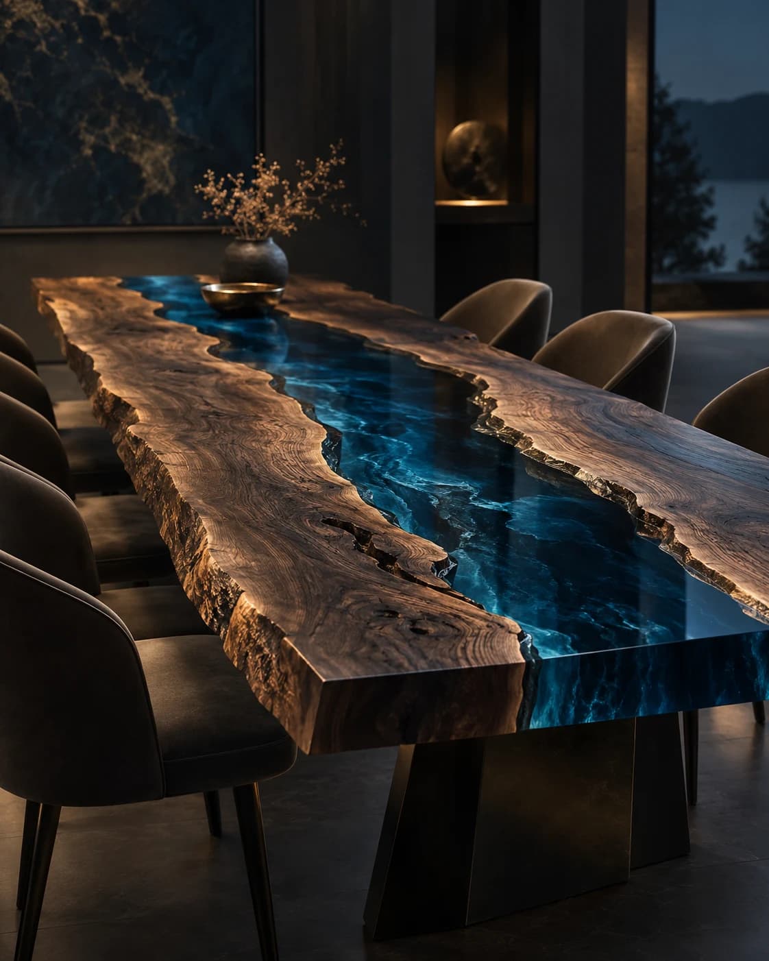
River Channel
Live-Edge Dining Table
Live-edge timber · pigmented resin · metal baseDP001 / Price on request
Build a palette from the room you already have, then explore how a material-led object can introduce contrast, repetition and a little visual breathing space.
By RivyaLivingArt · 4 minute read
A warm neutral interior is rarely one single colour. A wall may look softly cream beside a pale textile and more yellow beside a cooler stone. Before adding a resin-art object, make a small inventory of the surfaces that will remain: the largest floor area, the main upholstery, the most visible timber and the background wall. Describe what you actually see rather than beginning with a fashionable palette name.
You do not need to resolve every colour relationship immediately. Give each existing surface a role in the brief and note which combinations you already enjoy. A room with varied quiet tones may invite a stronger focal object, while another may benefit from a more restrained addition. The useful starting point is the composition you have, including its imperfections and ordinary daylight.
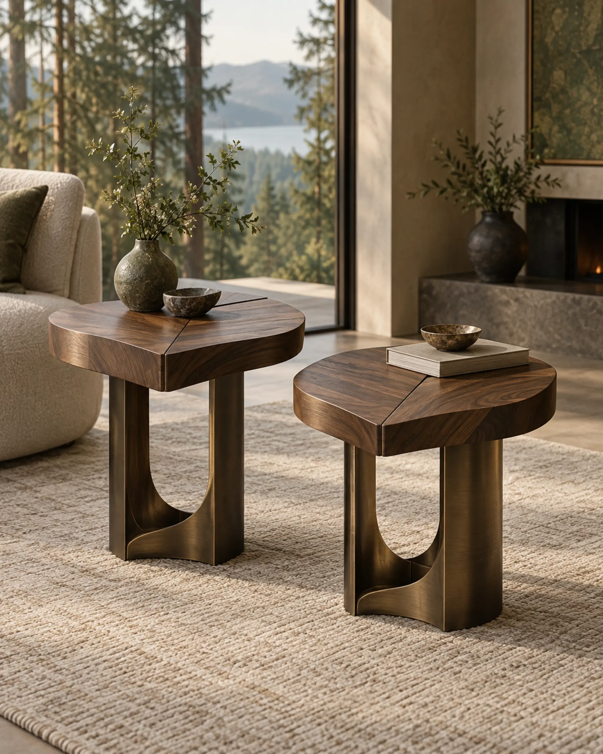
Decide whether the new piece should anchor the room, connect existing elements or introduce a deliberate interruption. A dining table might carry the strongest material contrast, while a pair of side tables could repeat a smaller detail. That distinction keeps the conversation focused. Without it, an attractive reference can lead to a request for an object that competes with the features you most want to preserve.
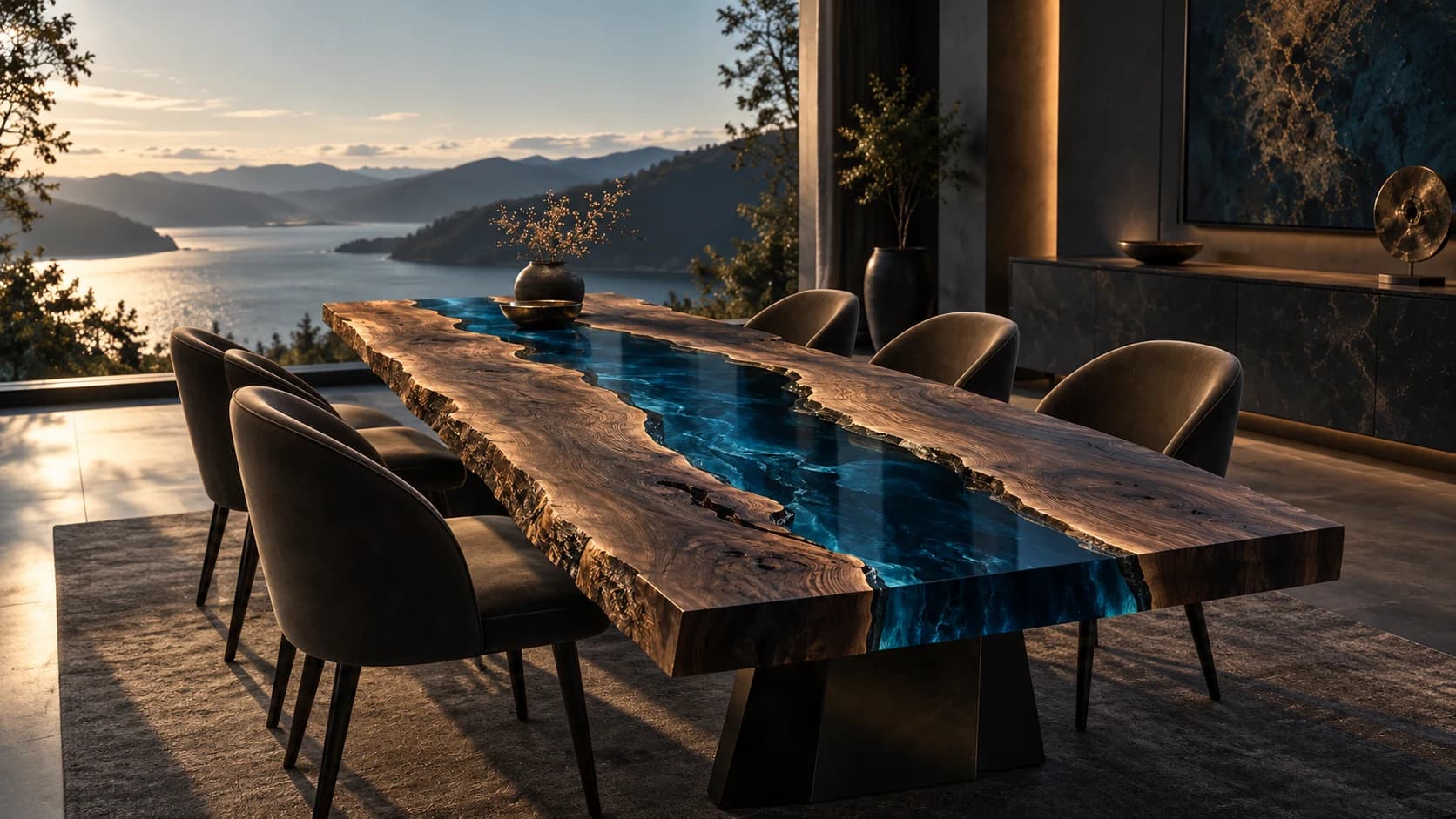
Try an imaginary arrangement of oat-coloured fabric, a warm timber note and a small dark accent. Then try the same room with a lighter focal surface and a more visible base. These are composition exercises rather than prescribed combinations. Label them as alternatives, and explain which relationship interests you: the contrast between light and dark, the repetition of warmth or a quieter transition between neighbouring surfaces.
Keep the palette small enough that each addition has a reason. When every reference introduces another colour, it becomes hard to know which choice is carrying the idea. A short written note can restore that clarity: retain the sofa, relate to the floor, let the table provide the contrast. The note gives a designer freedom to develop the intention without reproducing a reference interior.
In a restrained palette, texture can provide differences that colour alone does not explain. A woven textile, a visually grained surface and a quiet painted wall each introduce a different pattern of detail. Describe those visible qualities separately from how a material might feel. A photograph can suggest a texture, but examining a physical material sample supplies information that a screen cannot settle.
Consider where the room already has a lot to look at. If the rug is patterned and the shelving is full, a simpler object outline may offer a pause. If large background areas are visually quiet, a more expressive material composition may become the focus. These are options to explore in your own setting, not rules that every neutral interior must follow or claims about a particular resin finish.
A reference interior can be useful when you can explain the relationship you admire. Perhaps a dark object feels balanced by a large pale wall, or several warm surfaces are interrupted by one cooler detail. Write down that observation and set aside the temptation to reproduce every furnishing. Your room’s architecture, retained objects and daily use deserve a response of their own.
Use only references you are entitled to share, and keep their source visible in a real project brief. Do not present another designer’s room as a RivyaLivingArt installation or an instruction to duplicate its objects. An original design board can instead use your room sketch, plain colour notes and approved product studies. This makes the intention readable without confusing inspiration, authorship and a proposed commission.
Before a final decision, ask how the relevant material and finish references can be considered alongside the existing surfaces. Record the viewing context rather than declaring that one screen image proves a match. Note which choices are fixed, which are preferred and which remain open. That small distinction helps prevent a provisional palette from becoming an apparently approved specification during a longer project conversation.
Begin with the room around the object: sightlines, everyday movement and the kind of gathering you want a table to hold. A planning notebook for a future commission.
Read the story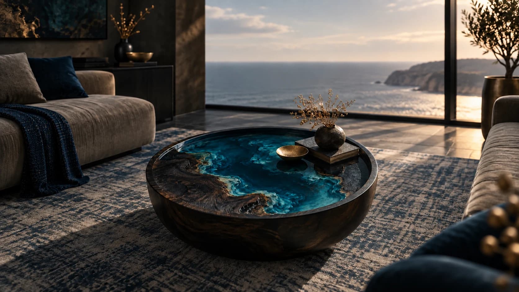
Study a low table through silhouette, the space beneath it and its relationship with seating. An editorial exercise in making an object belong to a larger composition.
Read the story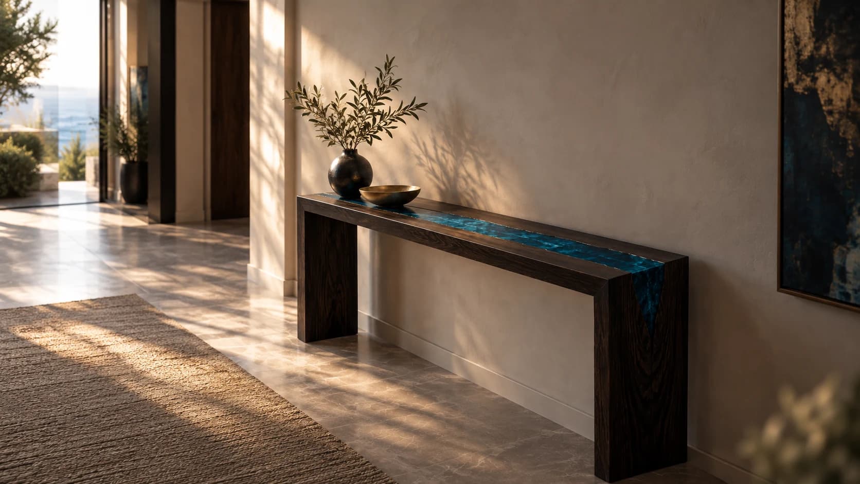
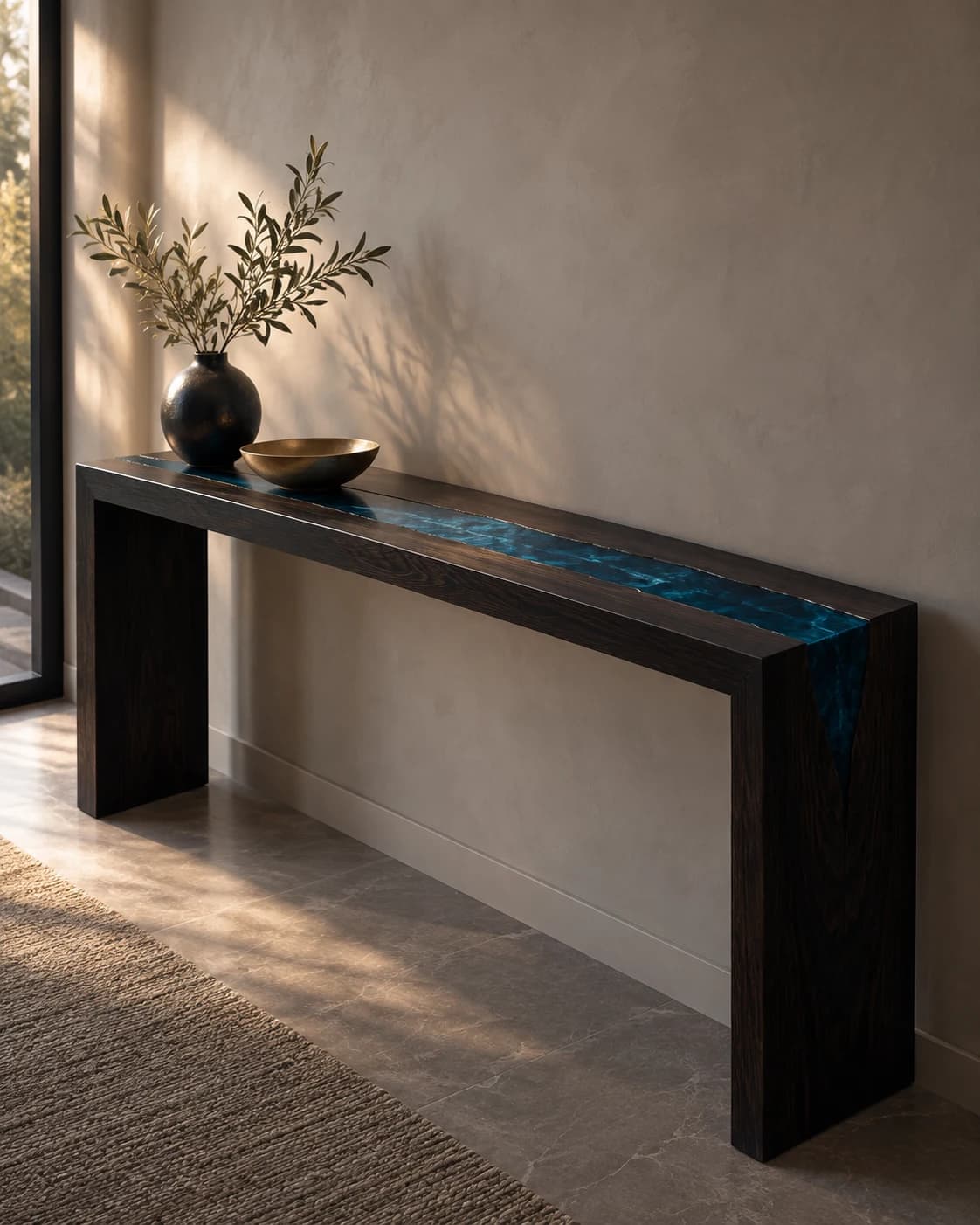
Plan an arrival space through rhythm, everyday objects and the view beyond the doorway. A console can anchor the composition while leaving the practical questions visible.
Read the story